如果你对显示技术有足够的执念,你一定会发现当下的 HDR(高动态范围)生态是一个充满术语、标准互殴以及营销话术的“黑暗森林”。从 PQ 到 HLG,从杜比视界(Dolby Vision)的各类 Profile 到各种级别的 DisplayHDR 认证,普通消费者甚至许多专业玩家都容易迷失其中。
本文将剥开营销的外衣,从最硬核的底层逻辑出发,带你彻底搞懂 HDR 动态元数据(Dynamic Metadata) 是如何运作的,剖析 PQ 与 HLG 曲线的本质区别,深挖 Dolby Vision Profile 5 与 Profile 8.4 的技术分歧,并最终推演:在从 SDR 废铁到理论上“完美显示器”的不同阶级下,动态元数据究竟扮演着怎样的角色。
一、光与电的契约:PQ 与 HLG 的本质分歧
要理解动态元数据,我们必须先理解 HDR 的基石——EOTF(电光转换函数,Electro-Optical Transfer Function)。它的作用是将数字信号(0和1)翻译成屏幕上实际发光的亮度(nits 或 cd/m^2)。在 HDR 时代,两大流派统治了世界:PQ 和 HLG。
1. PQ 曲线 (Perceptual Quantizer / SMPTE ST 2084)
PQ 曲线的核心哲学是“绝对亮度映射”。它是杜比实验室基于人类视觉系统(Barten 阈值模型)推导出的非线性曲线,最高支持到 10,000 nits。
在 PQ 的世界里,信号代码与物理亮度是绝对绑定的。如果视频文件中的某个像素对应的信号值要求输出 1000 nits,那么无论是放在 400 nits 的入门显示器上,还是放在 4000 nits 的顶级监视器上,这个像素“本该”被点亮到 1000 nits。
硬核公式: PQ的非线性信号 N 转换为线性亮度 Y 的 EOTF 公式如下:
$$Y = \left( \frac{\max[(N^{1/m_2} – c_1), 0]}{c_2 – c_3 N^{1/m_2}} \right)^{1/m_1}$$
(注:其中 $m_1, m_2, c_1, c_2, c_3$ 均为为了拟合人眼视觉感知的常数。)
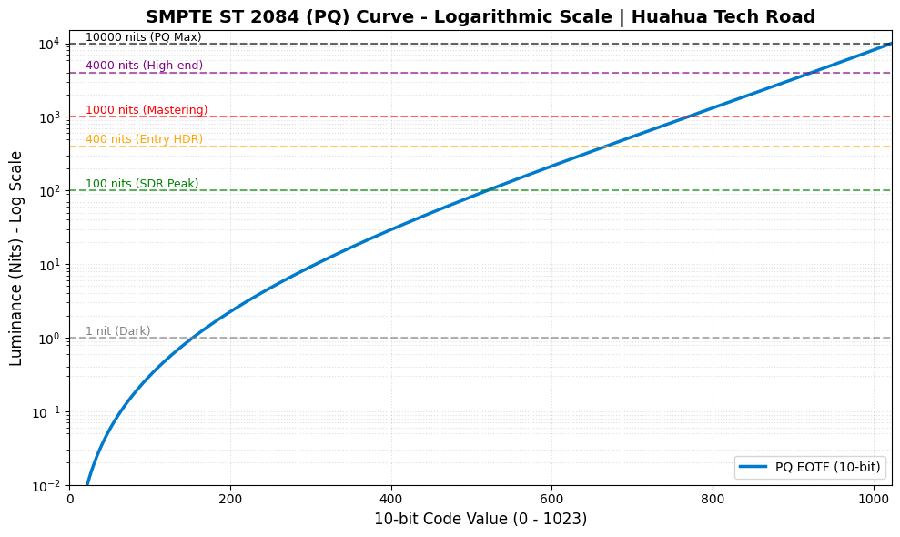
致命弱点: 因为 PQ 是绝对的,所以当内容要求的亮度超过显示器的物理极限时(比如内容要求 4000 nits,显示器只能亮 600 nits),显示器就必须进行“色调映射(Tone Mapping)”。这就是为什么 PQ 极其依赖元数据。
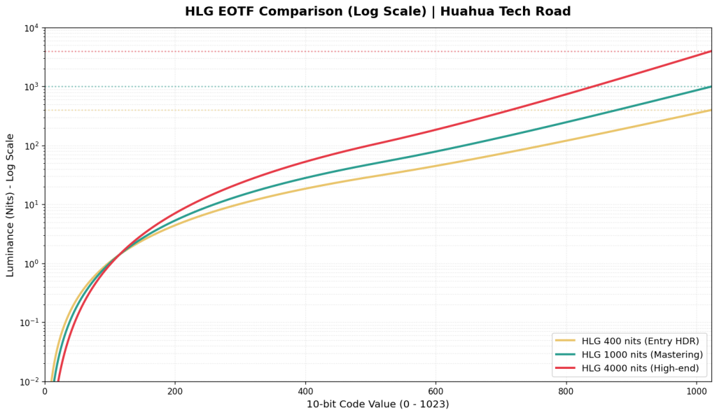
2. HLG 曲线 (Hybrid Log-Gamma / ARIB STD-B67)
HLG 是由 BBC 和 NHK 联合开发的,它的哲学是“相对亮度映射”。它放弃了对绝对亮度的执念,转而关注“比例”。
HLG 的暗部到中间调使用传统的 Gamma 曲线(兼容 SDR),而高光部分使用对数(Log)曲线。
$$E = \begin{cases} \sqrt{3} L^{0.5} & 0 \le L \le 1/12 \\ a \ln(12L – b) + c & 1/12 < L \le 1 \end{cases}$$
由于是相对映射,HLG 信号不需要告诉显示器“这个像素必须是 1000 nits”,而是说“这个像素是最高亮度的 80%”。显示器会根据自身的最大亮度(比如 600 nits)自动进行缩放分配。因此,标准 HLG 天然不需要元数据也能正常显示。
二、什么是动态元数据(Dynamic Metadata)?
要真正理解动态元数据(如 Dolby Vision, HDR10+ / SMPTE ST 2094)的降维打击能力,我们必须先看看它的前辈——标准 HDR10 是如何工作的。
HDR10 依赖的是静态元数据(Static Metadata)。它就像是一个极其死板的电影放映员,只在电影开场前看一眼数据表:整部电影最亮的一个像素是多少(MaxCLL,比如 4000 nits),平均亮度是多少(MaxFALL)。然后,你的显示器(假设它只有 600 nits 的峰值亮度)会基于这个 4000 nits 的全局极值,生成一条色调映射曲线,并死死锁定,贯穿整部电影的两小时,绝不更改。
相比之下,动态元数据则是在逐场景(Scene-by-Scene)甚至逐帧(Frame-by-Frame)地发送指令。它像是一个坐在显示器芯片旁边的调色师,实时指挥。
让我们把这两者放在一台 600 nits 的普通 HDR 显示器上,看看它们在同一部电影的不同场景中表现有多悬殊:
场景A(阳光沙滩 – 画面峰值 4000 nits):
- HDR10(静态): 电视知道全局最高是 4000 nits,当前画面也确实刺眼。为了把 4000 nits 的巨额信号塞进自身 600 nits 的硬件瓶颈里,电视开启高光压缩模式(Roll-off),保全了天空中高光云层的层次,但代价是整个沙滩的平均亮度不可避免地被全局压暗了。
- 动态元数据: 同样收到 4000 nits 的指令,同样进行高光压缩。在这个极限高光场景下,动态元数据和 HDR10 的表现差异不大,都在努力“防爆”。
场景B(地下室惊魂 – 画面峰值仅 200 nits):
- HDR10(静态)的灾难: 这是静态元数据的致命伤。尽管当前地下室画面的最高点只有 200 nits,远远低于电视本身的 600 nits 物理极限,但电视是个死脑筋,它依然死死套用着之前为了防范 4000 nits 阳光沙滩而设定的那套“全局防爆曲线”。
- 让我们来算一笔残酷的账: 假设这台电视采用了一种标准的保守压缩策略——在 100 nits(传统 SDR 的白点)之前保持 1:1 精准映射,然后将超过 100 nits 直至 4000 nits 的庞大信号区间,生硬地按比例塞进显示器仅剩的 100 ~ 600 nits 发光空间里。
- 此时,对于地下室中一个原本要求发光 200 nits 的暗部细节像素,它的实际输出亮度 Lout 将被压缩为:$$L_{out} = 100 + (200 – 100) \times \left( \frac{600 – 100}{4000 – 100} \right) \approx 112.8\text{ nits}$$
- 看到了吗?原本应该有 200 nits 亮度的物体,被生生削弱了将近一半,掉回了只有 112.8 nits 的类 SDR 亮度区间。 结果就是,原本就不亮的地下室被全局无脑压暗,暗部细节(比如角落里潜伏的怪物)彻底糊成一团死黑,原本优秀的 HDR 游戏/电影观感荡然无存。
- 动态元数据的降维打击: 实时指令告诉电视:“注意,这一幕最高只有 200 nits,立刻解除高光压缩警报!” 电视收到指令,瞬间废弃了那条苟延残喘的 4000 nits 映射曲线,切换至新的逻辑:0 ~200 nits 范围内 1:1 直接输出亮度,不做任何压缩计算。瞬间,地下室的暗部细节被完全点亮,怪物的轮廓呼之欲出。这台只有 600 nits 的普通电视,在这一刻表现得就像一台完美的参考级监视器。
这就是动态元数据的本质:它是一本“实时指导手册”,教导能力不足的显示器如何在不破坏创作者意图的前提下,榨干自己的每一滴硬件性能。 硬件越羸弱,这本手册的救命作用就越大。
三、杜比视界的双面人:Profile 5 与 Profile 8.4
同样是 Dolby Vision,底层逻辑却可能天差地别。目前主流的内容分发中最常见的是 Profile 5(流媒体巨头最爱)和 Profile 8.4(苹果 iPhone 拍摄的默认格式)。
1. Dolby Vision Profile 5:纯粹的专制者
- 基础曲线: PQ
- 色彩空间: 独家 IPTPQc2 (取代传统的 YCbCr)
- 特点: 这是杜比最纯粹、最硬核的封装格式。它完全没有向后兼容性(没有后备的 HDR10 或 SDR 层)。如果你在一个不支持杜比视界的设备上强行播放 Profile 5,你会看到非常诡异的紫绿色画面。
- 为什么用 IPT? 传统的 YCbCr 空间在进行色调映射(降低亮度)时,容易发生“色偏(Hue Shift)”。杜比开发的 IPT 空间将亮度(I)与色度(P, T)进行了极其严格的解耦。当动态元数据指挥显示器压暗高光时,Profile 5 能确保颜色依然纯正,不会出现高光泛黄或发白。
2. Dolby Vision Profile 8.4:实用主义的混血儿
- 基础曲线: HLG
- 色彩空间: BT.2020 / YCbCr
- 特点: 这是苹果为了推广 HDR 录制而大力扶持的标准。它的底子是一层标准的 HLG HDR。在这层 HLG 之上,叠加了杜比视界的动态元数据(通过 SEI 信息封装)。
- 优势与妥协: 它的兼容性无敌。如果你把 iPhone 拍的 Profile 8.4 视频发给一台不支持杜比的普通 HDR 电视,电视会直接读取 HLG 底层,正常显示 HDR 画面;如果设备支持杜比,它就会提取动态元数据进行更精准的优化。虽然它没有 Profile 5 的 IPT 色彩空间那么严谨,但对于用户生成内容(UGC)和多设备分享来说,它是最佳选择。
四、众生相:动态元数据在不同阶级显示器上的“作用力”
现在,我们进入本文最核心的推演:当这本“实时指导手册”(动态元数据)下发到不同级别的显示设备时,会发生什么?
1. SDR 显示器 (~100 – 250 nits, Rec.709)
- 作用大小:极大(决定生死)
- 解析: 把 HDR 放在 SDR 显示器上播放,是一个把“三维空间降维打击成二维”的过程。如果不依赖动态元数据,播放器只能进行极其粗暴的全局线性压缩或者直接截断(Clipping),导致画面色彩寡淡、高光死白、暗部死黑。
- 动态元数据的介入: 配合支持杜比解码的播放端(如 Apple TV 配合优质的转换算法,或 madVR 渲染器),动态元数据会实时告诉转换器当前画面的亮度分布。算法可以根据这些数据,每一帧都重新生成最优的 Gamma 曲线,从而在 100 nits 的狭小空间里,尽可能“骗”过人眼,保留 HDR 应有的对比度错觉。
2. HDR400 / HDR600 (侧入式背光 / 无分区控光或极少分区)
- 作用大小:极其关键(遮丑神器)
- 解析: 这一阶层被称为“假 HDR”。它们虽然能看懂 PQ 曲线,但硬件素质极差。当面对 1000 nits 或 4000 nits 的 HDR 内容时,它们必须进行极为剧烈的色调映射(Tone Mapping)。
- 动态元数据的介入: 如果没有动态元数据,HDR400 显示器面对 4000 nits 极限的内容,只能全局极度压暗。有了动态元数据,显示器在暗场景可以全功率输出保证亮度,在高光场景则通过智能的 Knee-point(拐点)平滑过渡高光。动态元数据在这里的作用是“拯救观感”,防止你的显示器因为无脑映射而变成一坨黑乎乎的马赛克。
3. HDR1000 (Mini-LED / 高端 OLED / 几百至上千分区控光)
- 作用大小:中等偏上(锦上添花,细节雕琢)
- 解析: 这是一个分水岭。目前好莱坞大量的电影正是在最高 1000 nits 的监视器上完成调色的(例如索尼的 BVM-HX310)。
- 动态元数据的介入: * 如果内容本身就是 1000 nits 封顶: 你的显示器硬件已经能够 1:1 完美跟踪 PQ 曲线直到最高点。此时,不发生任何压缩,色调映射处于休眠状态,动态元数据几乎不起作用。
- 如果内容是 4000 nits 封顶(如华纳兄弟的一些电影): 此时,对于 0-1000 nits 的部分,显示器精准还原;对于 1000-4000 nits 的高光(如太阳、火花、霓虹灯),动态元数据将指导显示器如何优雅地将这部分超出的亮度压缩进自己 1000 nits 的极限里,从而保留云层的层次和爆炸的焰火细节。
4. HDR4000 (顶级参考级监视器 / 未来的家用旗舰)
- 作用大小:微乎其微(基本闲置)
- 解析: 当显示器的全屏或峰值亮度真正达到 4000 nits,且拥有像素级控光能力(如未来的 Micro-LED 或极致的双层 LCD)时,它已经具备了硬吃当前市面上 99.9% 蓝光及流媒体原盘数据的能力。
- 动态元数据的介入: 在这类怪兽级硬件面前,所有的色调映射算法大部分时间都在睡大觉。PQ 曲线在这台显示器上得到了绝对的尊重。动态元数据只在极端罕见的场景(例如某个电影使用了 10,000 nits 的母版进行调色)下才会稍微活动一下筋骨。
5. 理论上的完美显示器(无限亮度,完全的纯黑,100% Rec.2020 色域)
- 作用大小:绝对为零(沦为废代码)
- 解析: 这是显示技术的终极乌托邦。在这台完美的设备上,它可以 1:1 完美跟踪 SMPTE ST 2084 的 PQ 曲线直到 Barten 模型的尽头。
- 不存在硬件瓶颈,就不存在超出硬件能力的信号,因此不需要进行任何色调映射(Tone Mapping = False)。
- 此时,无论电影封装了多么复杂、多么昂贵的 Dolby Vision 动态元数据,这台显示器看都不会看一眼。它只需要读取最原始的 0 和 1 的 PQ 视频流,将电信号转化为对应的绝对光子发射出去。在这里,元数据完成了它的历史使命,自我消解于完美的硬件之中。
结语:一场由硬件妥协引发的华丽打磨
回望整个 HDR 的技术栈,你会发现一个有趣的悖论:动态元数据技术越发达、越重要,恰恰说明我们当下的显示硬件越羸弱。 PQ 曲线设定了一个理想国的标杆,而现实中的显示器参差不齐。Dolby Vision 等动态元数据技术,本质上是顶级算法工程师为了弥补“理想信号”与“残缺硬件”之间的鸿沟,所开发出的一套极致复杂的妥协艺术。当你看着一台千元级 HDR400 屏幕,因为杜比视界的加持而勉强呈现出不错的阳光质感时,你看到的是无数行代码在后台疯狂运算、妥协与挽救的成果。
那么,对于正在搭建或升级桌面/家庭影院系统的你而言,在预算有限的情况下,你是更倾向于购买一台账面数据惊人但只支持静态 HDR10 的显示器,还是宁愿牺牲一点峰值亮度,去追求一台完美支持 Dolby Vision 动态映射的设备呢?
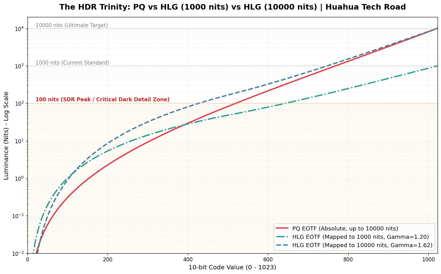
附录:巅峰对决:当 HLG 被强行拉升至 10000 nits,谁在裸泳?

如果说 1000 nits 是当下主流 HDR 的及格线,那么 10000 nits 就是显示技术的“终极试炼场”。这也是验证 PQ(绝对映射)与 HLG(相对映射)底层哲学差异的最佳显微镜。
让我们把标准的 HLG 1000 nits 曲线也加入战局。根据 ITU-R BT.2100 标准,在 1000 nits 显示器上,HLG 的系统 Gamma(OOTF Shift)是相对温和的 1.2;但如果我们要在一台理论峰值为 10000 nits 的完美显示器上播放相同的 HLG 信号,显示器必须将系统 Gamma 飙升至惊人的 1.62,以此来暴力拉伸画面对比度。
当我们把这条优雅的 HLG 1000 nits 曲线、被极端拉伸的 HLG 10000 nits 曲线,与天生为 10000 nits 打造的 PQ 曲线放在同一张对数坐标图上时,一个极其反直觉、却又无比符合物理学定律的真相浮出水面:
1. 暗部与中灰的较量:PQ 的绝对锚定 vs HLG 的“数据雪崩”
在电光转换曲线(EOTF)中,有一个绝对真理:曲线越平缓,分配的数字色阶(Code Value)就越多,色彩过渡就越细腻;曲线越陡峭,色阶数据越少,亮度跨度越大,越容易出现断层(Banding)。
- HLG 1000 nits 的“SDR 偏袒”: 这是一个极其惊人的事实——在标准的 1000 nits 环境下,HLG 在 0 到 100 nits(传统 SDR 亮度,人眼最敏感区域)分配了极其夸张的数据量。它足足消耗了约 644 个 Code Value(占比高达 63%)!这就是为什么 HLG 具有极强的 SDR 向下兼容性,因为它的前半段基因几乎就是为传统屏幕量身定制的。在这个亮度下,它的暗部过渡丰富到溢出。
- PQ 的“绝对锚定”: 相比之下,红色的 PQ 曲线无论在什么显示器上,都死死锚定着 Barten 视觉阈值。在 0 到 100 nits 区间,它永远恒定支出约 520 个 Code Value(占比约 51%)。它不偏袒任何人,只忠于人眼生理学,步步为营地保证暗部渐变如丝般顺滑。
- HLG 10000 nits 的“数据雪崩”: 灾难发生在被拉伸的 HLG 10000 nits 铁线上。在高达 1.62 的 System Gamma 暴力拉扯下,为了把亮度顶到 10000 nits,它被迫将暗部的数据疯狂“抽血”。原本在 100 nits 以下享有 644 个台阶的暗部和中灰,此时被生生压缩到了仅剩 428 个台阶(占比暴跌至 42%)! 整整丢失了 200 多个台阶,导致这片最敏感区域的曲线变得极其陡峭,每一步的物理亮度差被硬生生拉大,直接击穿了 Barten 阈值的保护罩。这就完美解释了为什么 HLG 在拉伸到超高亮度显示器时,最先崩盘、出现惨不忍睹的等高线色带(Banding)的地方,恰恰是原本数据最丰沛的暗部和中灰色块!
2. 高光区的殊途同归:人眼的“致盲妥协”
如果你继续往图表的右上方看(1000 nits 到 10000 nits 的极限高光区),你会发现一个有趣的现象:之前在暗部分歧巨大的 PQ 和 HLG 10000nits 曲线,在这里竟然高度重合,都变得极为陡峭平滑(在对数图表上表现为相似的收束)。
- 底层数学的切换: HLG 在信号跨过 50% 之后,舍弃了下半段的 Gamma 曲线,切换成了纯粹的对数曲线(Log Curve);而 PQ 的整体数学模型,在高光区域也是极其接近对数特性的。此时,无论是 1000 nits 还是 10000 nits 的 HLG,其高光压缩逻辑与 PQ 殊途同归。
- 生物学的真相: 在几千 nits 的刺眼高光下(比如直视太阳、电焊火花或爆炸),人眼会发生生理性的“眩光致盲”,对比度敏感度极度下降。不管是杜比的科学家还是 BBC 的工程师,大家都心照不宣地达成了共识:没必要给高光浪费太多数据。
因此,在这个极高亮区间,两套标准都在进行疯狂的“高光压缩”,它们都极其默契地只用剩下的 25% 左右 Code Value,去跨越了 90% 的物理亮度区间 (1000 nits ~ 10000 nits)。在这片“人类视觉盲区”里,它们达成了惊人的和解。谁让人类是用对数感知世界的(这其实是一种生物学保护)。
小结:皇冠属于谁?
这场从 1000 nits 到 10000 nits 的终极推演告诉我们:HLG 是一把极其优秀的“瑞士军刀”,它用相对映射和无元数据解决了广电系统向下兼容的痛点,在 1000 nits 以下表现优异。但在冲击理论极限时,其底层相对映射机制会引发暗部“数据抽血”,造成的 JND(最小可觉察差异)爆表,注定了它无法承载极致的视觉体验。
对于真正追求极致的 HDR 生态(好莱坞母带、顶级 3A 游戏大作)而言,基底采用 PQ 曲线,上层辅以逐帧指导的动态元数据(Dolby Vision),才是通向“完美显示”的唯一真理。